

Our daily lives are are saturated with amazing images. Visual design experiments become hot graphic design trends, and suddenly we see them everywhere.
Striking visual designs are plastered all over the sides of buses, posters, billboards, TV ads, magazines and of course, digital products. They have many names, including duotone, double exposure, scan lines, glitch, smudge, color channel, photo masking, vibrant-garish colors, and misprint.
As with fashion, design trends are often recycled from decades past—we see them coming back again and again: Russian constructivism, Bauhaus, screen printing, 1970’s… etc. Simple, saturated geometric design patterns have been around for almost a century, and designers are still using them because they’re just as effective as they were 100 years ago.
Luckily, today’s designers have a much wider variety of digital tools with which to create these trendsetting effects than they did in earlier days. Still, even though the tools may be easier to come by, let’s not forget that it’s brave creativity and visual innovation that will forge the freshest, most compelling designs.
Should Designers Follow Design Trends?
Some creative directors and designers may resist design trends because they don’t want to be seen as “followers.” However, using graphic design trends could prove to be an important decision because doing so can help make a designer more contemporary. Daring to be different also has its rewards. The best designers “follow and borrow” heavily from trends—past and present—at times creating something entirely new by combining graphic design trends into something striking and fresh.
Word of caution—designers should use graphic design trends in their work only when appropriate, and keeping branding in mind. For example, people expect stability and trust from banking, investing, insurance brands, and so on—so a subversive counter-culture effect like “glitch” may not be appropriate in these cases.

Let’s look at a few of these hot graphic design trends, and share some of the top Photoshop tutorials on how to create them.
Hot Design Trend: The Double Exposure Effect
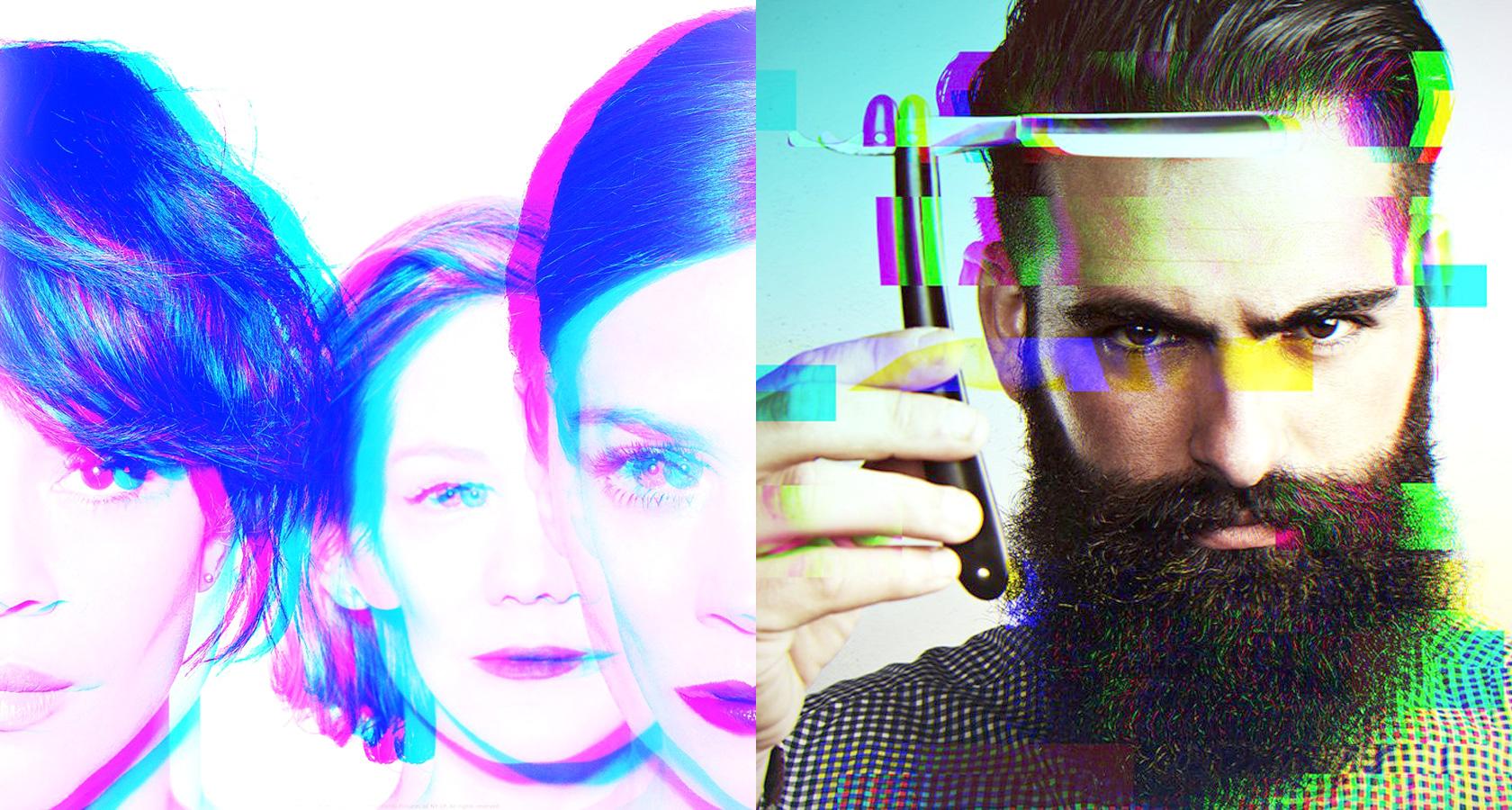
Spectacular image combinations can be achieved by using the “double exposure” effect. The name comes from celluloid film photography where two or three photos are taken without winding the film forward in the camera, exposing the same frame multiple times with different images. This trend featured a lot on movie posters and TV promos. As seen above, TV show opening titles such as True Detective on HBO have been using this effect with motion graphics to great affect.


In order to achieve a great double exposure effect, careful image selection is very important. High-contrast images work best when darker areas take up an area of the image where another image is going to be used. Juxtaposing a portrait with a more detailed image such as a cityscape or landscape is often done.
Here are some top Photoshop tutorials on how to achieve this hot design trend:
Double Exposure Effect Photoshop Tutorial #1:
Double Exposure Effect Photoshop Tutorial #2:
Double Exposure Effect Photoshop Tutorial #3:
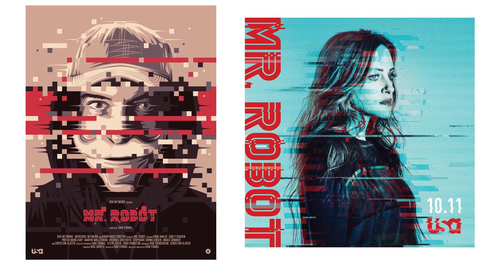
Glitch, Misprint, Visual Interference Effects
This is a double-taker. It catches the eye in a sea of “perfect images” because it’s all about imperfection. It’s based on the unexpected result of digital errors known as “glitches.” Everything around us—advertising, posters, magazine covers, and TV promos—has been Photoshopped to perfection, (some would even call it “fakery” or “visual pollution”), thereby driving a desire to see more real, organic, less-than-perfect images.
Often more appealing to younger generations, this design trend is a subversive, counterculture, “anti-fake” movement intended to make designs stand out. As mentioned above, it may not be appropriate for some situations or brands, so designers are advised to tread carefully if choosing to implement this effect.
Most designers would use the term “glitch,” but sometimes it’s called a VHS effect, RGB shift with scan lines, misprint or visual interference. Innovative designers sometimes combine several types of these vogueish effects into something new.

Everyone has their own method of creating this effect, so look around YouTube and pick one that you like. There are even Photoshop Actions designers can buy to create the glitch effect with just a few clicks. Here are a couple of top Photoshop tutorials on how to achieve this design trend:
Glitch Effect Photoshop Tutorial #1:
Glitch Effect Photoshop Tutorial #2:
There are even ways to achieve a cool glitch effect with only CSS as this slideshow demo and this landing page demo show.
Duotone Effects
Duotone has been around for a while but never seems to get tired. Hundreds of years ago Sanguine was used (red chalk on paper) to create simple one-tone drawings by artists such as Leonardo da Vinci. There’s something enduring about breaking an image down to simple tonality and a modern duotone image isn’t all that different from an old master’s sketch.

Today from Hollywood blockbuster posters to Apple and Spotify, everyone seems to be using the duotone effect. The purpose, again, is to stand apart, to be seen as something different. There are even Photoshop Actions and many mobile apps for creating duotone effects easily.


Here are some top Photoshop tutorials on how to achieve this happening design trend:
Duotone Effect Photoshop Tutorial #1:
Duotone Effect Photoshop Tutorial #2:
Duotone Effect Photoshop Tutorial #3:
RGB Split, Color Channel, Double Color Exposure
Here is another eye-catching effect that can use photos, text, and shapes. This effect sometimes uses 3 different images in 3 different color channels of the same subject, and juxtaposes them for an interesting image. This effect can sometimes also be seen as mixing together the glitch effect and RGB split effect. Some designers get really creative and mix double exposure, glitch and the RGB split effects.


Here are some top Photoshop and Affinity Photo tutorials on how to create this trending visual design effect (please disregard what they call the effect, everybody has a different name for it):
Double Color Exposure Effect Photoshop Tutorial:
Double Color Exposure Effect Affinity Photo Tutorial:
Vibrant, Garish Colors and Fluorescent Duotone Effects
Again, the goal here is to really stand out. This trend uses vibrant, saturated and fluorescent colors in generous amounts over the design.


The direction to take here is to be bold (when appropriate) and take risks with garish, saturated colors, whether it’s a website, album cover, or a poster.
Photo Masking, Cutouts, Abstractionism, Cubism
This is one of those recurring design trends that continues to be an enduring graphic design approach. It can be a hybrid of bold, flat color areas, montage, and masking. It’s a technique that is almost 100 years old, as these Russian propaganda posters from the 1920’s demonstrate.

To create works of wide-ranging color and complexity, during the last decade of his life Henri Matissedeployed two simple materials—white paper and gouache—that became his famous paper cutouts. A simple pair of scissors was the tool Matisse used to transform paint and paper into a world of plants, animals, figures, and shapes.
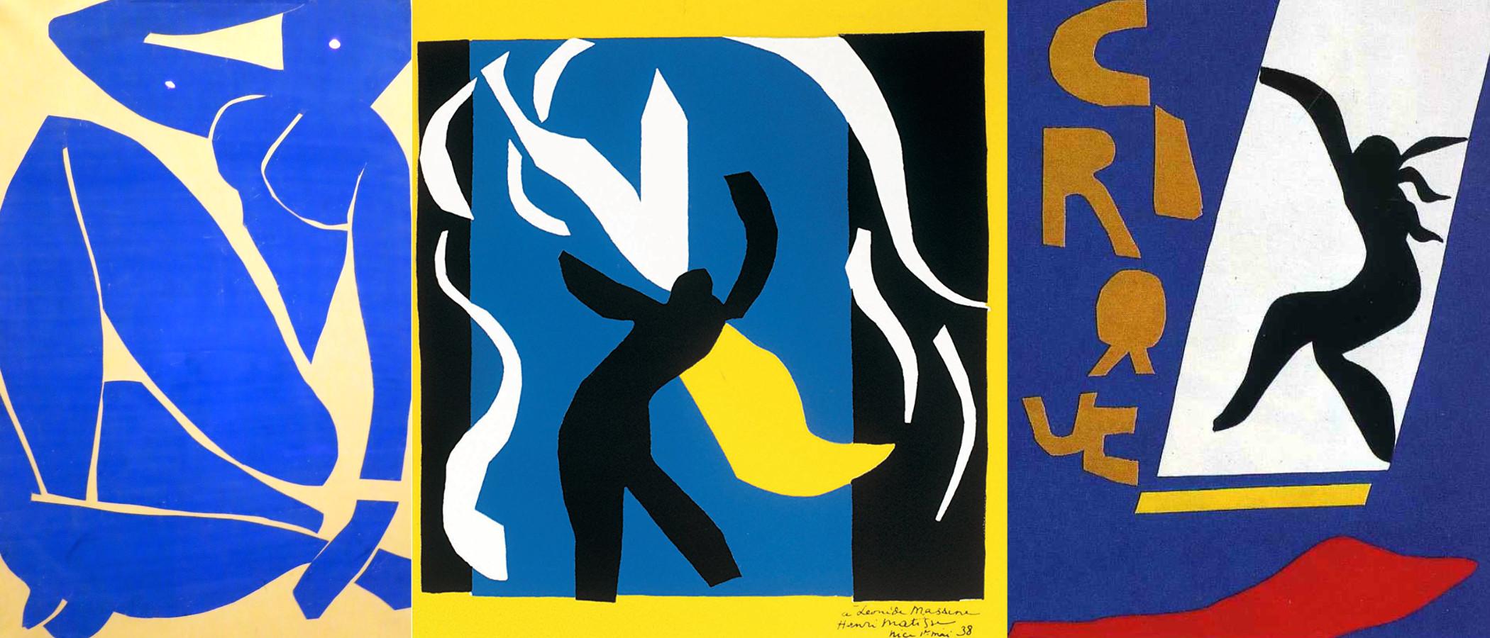
The digital variation of cubism, abstract art, and “cutouts” today is the photo-masking design trend employed by lots of designers to attract attention.


There are no hard and fast rules on how to create this effect. It all depends on the source materials and your creativity. Look for design and art inspirations such as the Russian propaganda posters, Picasso’s abstract cubist art and Matisse’s cutouts. Most of these photo masking techniques and collages can be created with layer masking in Photoshop. It’s more about photo selection and creativity, and less about technique.
Nevertheless, here are a couple of top Photoshop tutorials on how to create this hip design trend, the photo masking effect:
How to Create a Text Effect Poster Photoshop Tutorial:
How to Create a Letter Portrait Photoshop Tutorial:
Here’s another interesting Photoshop tutorial using photo masking to create this image:

The tutorial is an example of how a few simple techniques can be used to create elaborate illustrations using multiple layers, masking, the pen tool, some basic lighting, and one simple texture.
Explore, Be Brave and Set Your Own Course
Today, creative bravery isn’t optional. It’s what designers must do as people’s expectations rise and their attention becomes harder to capture. Don’t shy away from following some design trends. In fact, mix it up, do something new with them! Rock the status quo, be bold and explore your fancy. Take the leap! Be creatively brave!

Author: admin
I am the creative director at IGRAPHI and an award winning designer and web developer with 20 years of experience conceiving and implementing design and technical solutions across traditional, digital, and social media platforms to effectively engage target audiences with clients’ messages and products. Built and managed brands from the ground up, worn every hat on the rack, one brand at a time.


