

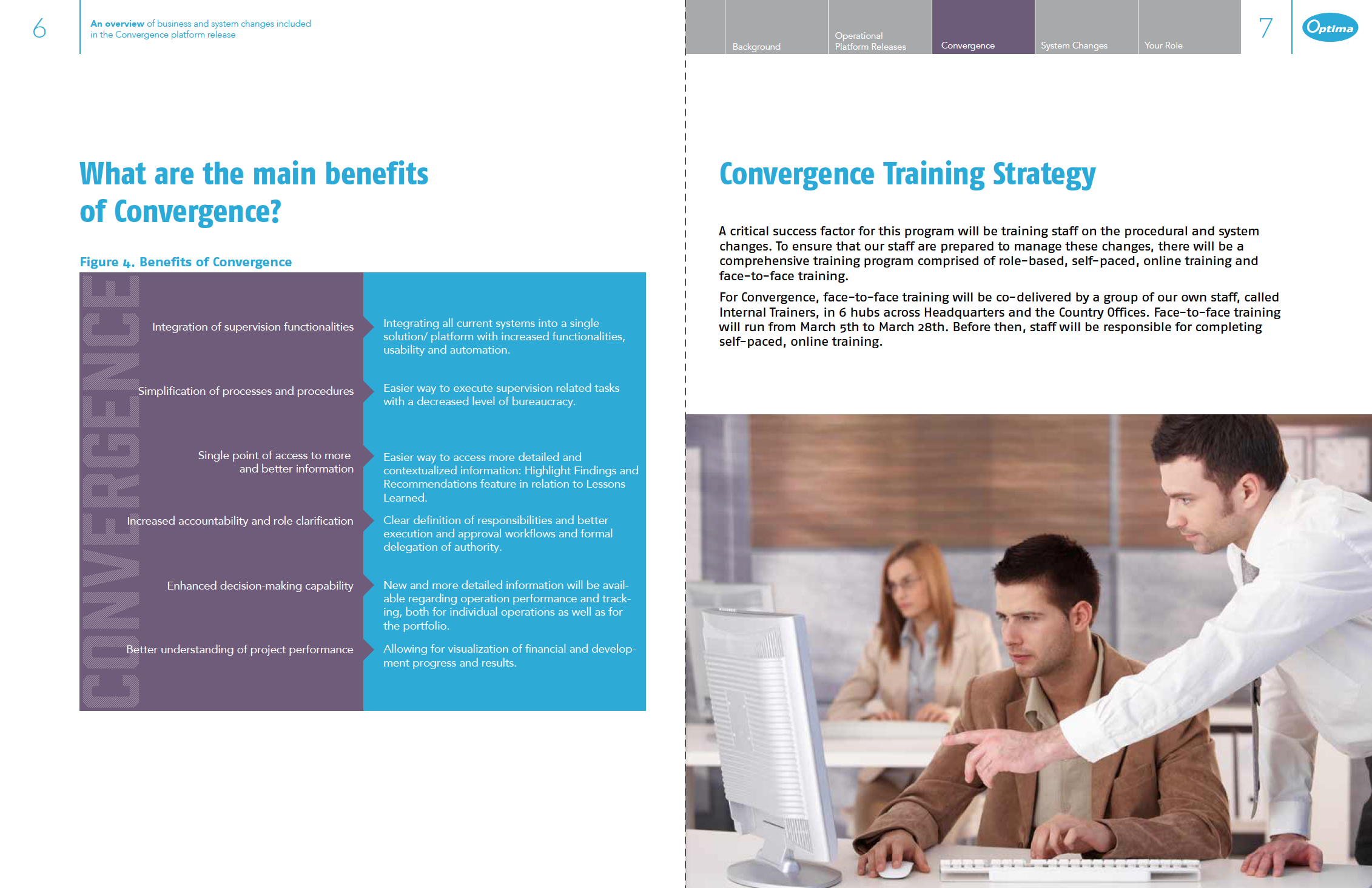
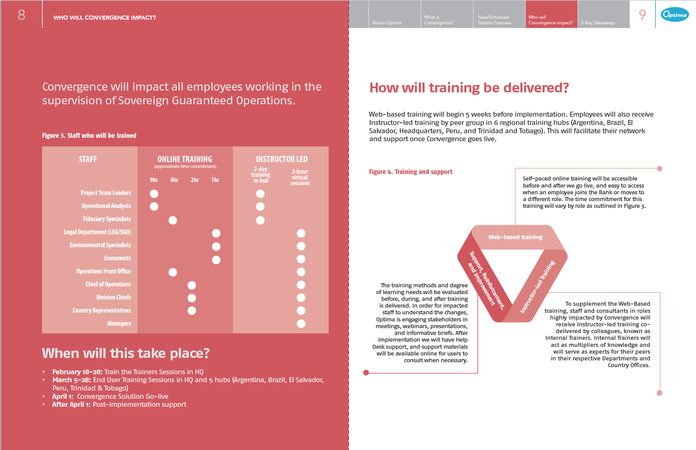
Every once in a while, I’ll come across a site that really makes me stop and think. A site that pushes the boundaries of what is known to be possible on the web. Whether it be the design aesthetic, usability, interactivity, sound design, or value that the site provides, we all know what it’s like to stumble across a masterpiece.
15 of the Best Website Designs to Inspire You
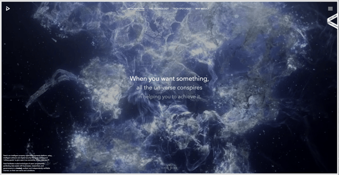
1) Feed
Not only is Feed an interesting concept, but it also has a stunning execution that challenges our understanding of what is possible on the web. Through a creative blend of animation and video, the site immerses the user into a very engaging experience. As an atypical site, it contains several unique usability elements as well, including a navigation that doubles as a scroll progress bar.
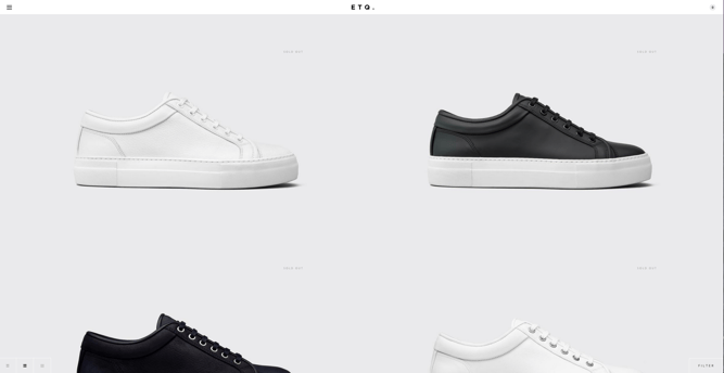
2) ETQ
ETQ takes a very minimalistic approach to ecommerce with their stripped-down site with big, compelling visuals of their product. Simple, flat, color-based backgrounds accompanied by strong typography help to keep the focus on exactly what the user came there to see: shoes.
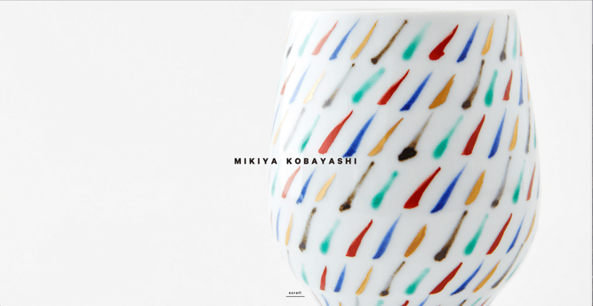
3) Mikiya Kobayashi
Mikiya is a Product Designer with a minimalistic portfolio that showcases his work through strong photography and subtle animations. His full site was originally created in Japanese and then translated into English, helping demonstrate the international scalability of his design.
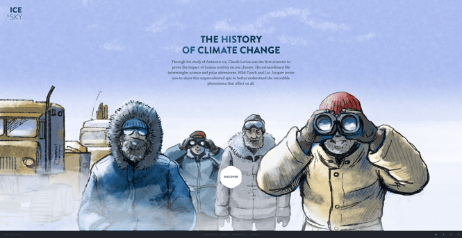
4) The History of Climate Change
Follow the footsteps of Luc Jacquet as Wild-Touch takes you along this visual and educational journey about the history of global climate change. A mixture of historical media and unique animations help tell the story.
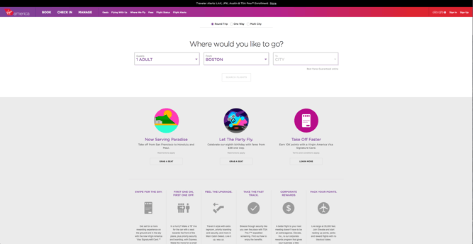
5) Virgin America
In a world where airline websites are known to be riddled with major usability issues, Virgin America has one of the best websites that pushes usability, accessibility, and responsive design forward. In fact, it’s been named as the first truly responsive airline website, a new precedent in the industry.
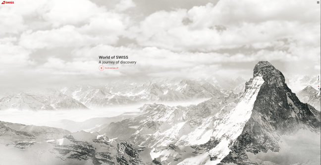
6) World of SWISS
Another airline?! What is happening?! Yep, SWISS airlines built an incredibly immersive site that tells their story and describes what it’s like to fly with them — and they simply did too great of a job to be ignored. Strong visuals and animations introduce the user to different sections of the site that are packed with information beyond the usual sales and marketing pitch that is so common today.
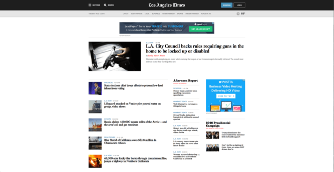
7) L.A. Times
While news sites aren’t exactly known for having the nicest designs or being the easiest to use, the Los Angeles Times site has been updated with a simple, newspaper-like design that’s easy to read and navigate.
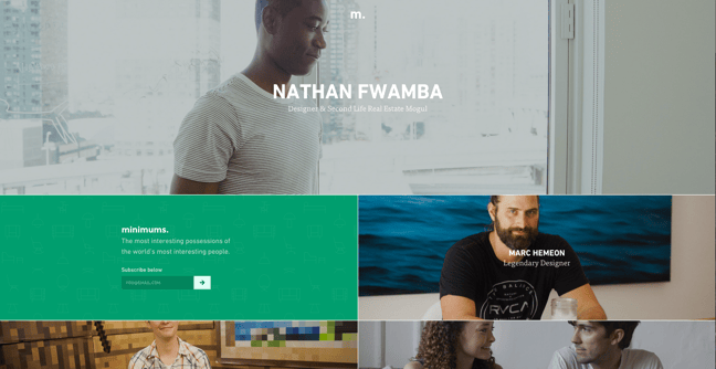
8) Minimums
Minimums takes a very bold approach to the way that they display their content, leveraging a grid-based website design, big typography, and full-width, high-quality images. Their site serves as a really nice example for how to properly execute a grid structure while still maintaining a nice visual hierarchy in the design.
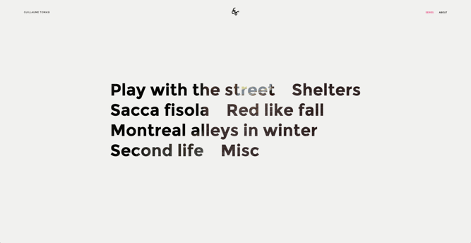
9) Guillaume Tomasi
As a Photographer in Montreal, Guillaume Tomasi has built a portfolio that’s truly fit to house his unique and awe-inspiring photography. His surreal photo style is juxtaposed by his simple, flat, empty, and minimalistic portfolio design that places all of the focus on the work itself. His unique series navigation coupled with art-gallery-inspired work introductions and perfect scrolling interactions yield an experience reminiscent of that of a real gallery.
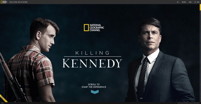
10) Killing Kennedy
Tons of media outlets covered the 50th anniversary of John F. Kennedy’s death, but because of its website design, National Geographic was able to stand out. Using parallax scrolling to display a blend of video, audio, and historical facts, the user is immersed in the story and duality of John F. Kennedy and Lee Harvey Oswald’s lives.
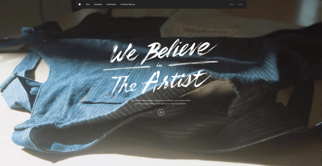
11) Big Cartel
Despite being a relatively large company, Big Cartel creates a very simple, straightforward, and compelling experience by leading with a creative headline, a video, and … pretty much nothing else. Simple navigation and nice examples of sites created with their platform helps to serve as supporting content that tells the rest of the story.
 Featured by BestWebsiteGallery
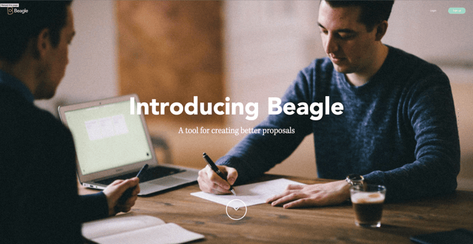
12) Beagle
Beagle does an exceptional job of visually and progressively telling the story of their product in a simple and easy-to-digest way. This is a major challenge for many startups, especially when they’re introducing new concepts to existing markets. People want to know, “What is your product? How does it work? Why do I care?” Beagle answers all those questions while simultaneously showing off their product and compelling the user to purchase. Plus, they’re one of few sites that actually implemented “scroll hijacking” correctly.
 Featured by BestWebsiteGallery
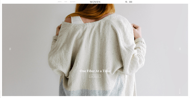
13) Woven Magazine
Woven is an online publication that celebrates artists, craftsmen, and makers alike. To me, they represent a confirmation that publications can (and should) have beautiful, engaging sites with easy-to-read content. Free of distractions like pop-ups and obtrusive ads, this site all about the experience of the content itself.
 Featured by BestWebsiteGallery
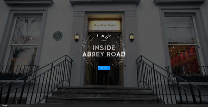
14) Inside Abbey Road
Google knocked it out of the park with this highly interactive site, which allows users to step into the Abbey Road Studios. Brilliant sound design, navigation mechanics, and visuals mixed with the usual “Google flair” all help draw visitors in to this well-made site.
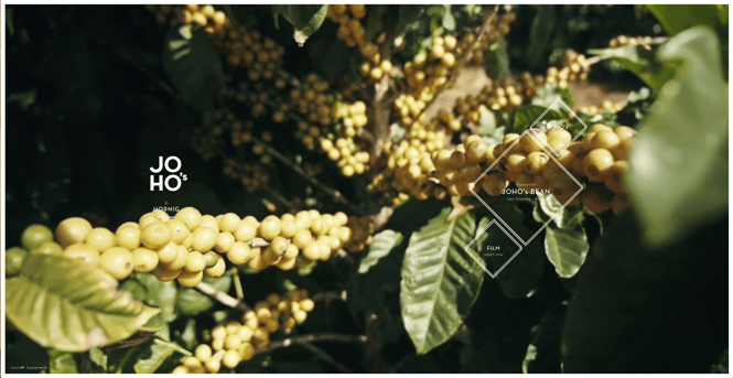
15) JOHO’s Bean
The website for JOHO’s Bean has incredible imagery, interactivity, story telling, visual design, and most of all, sound engineering. These all come together to create a compelling, emotional, and engaging site that tells the story of a coffee bean’s journey.
What websites do you admire — and why? Let us know in the comments.
Editor’s Note: This post was originally published in January 2014 and has been updated for freshness, accuracy, and comprehensiveness.
Related articles across the web


 Designs)