

iGraphi Design Studio
Visual
Intelligence.
A vibrant identity system for a design studio that turns complex work into clear, beautiful communication.
Brand Strategy
The foundational principles, tone, and messaging that define iGraphi.
The Slogan
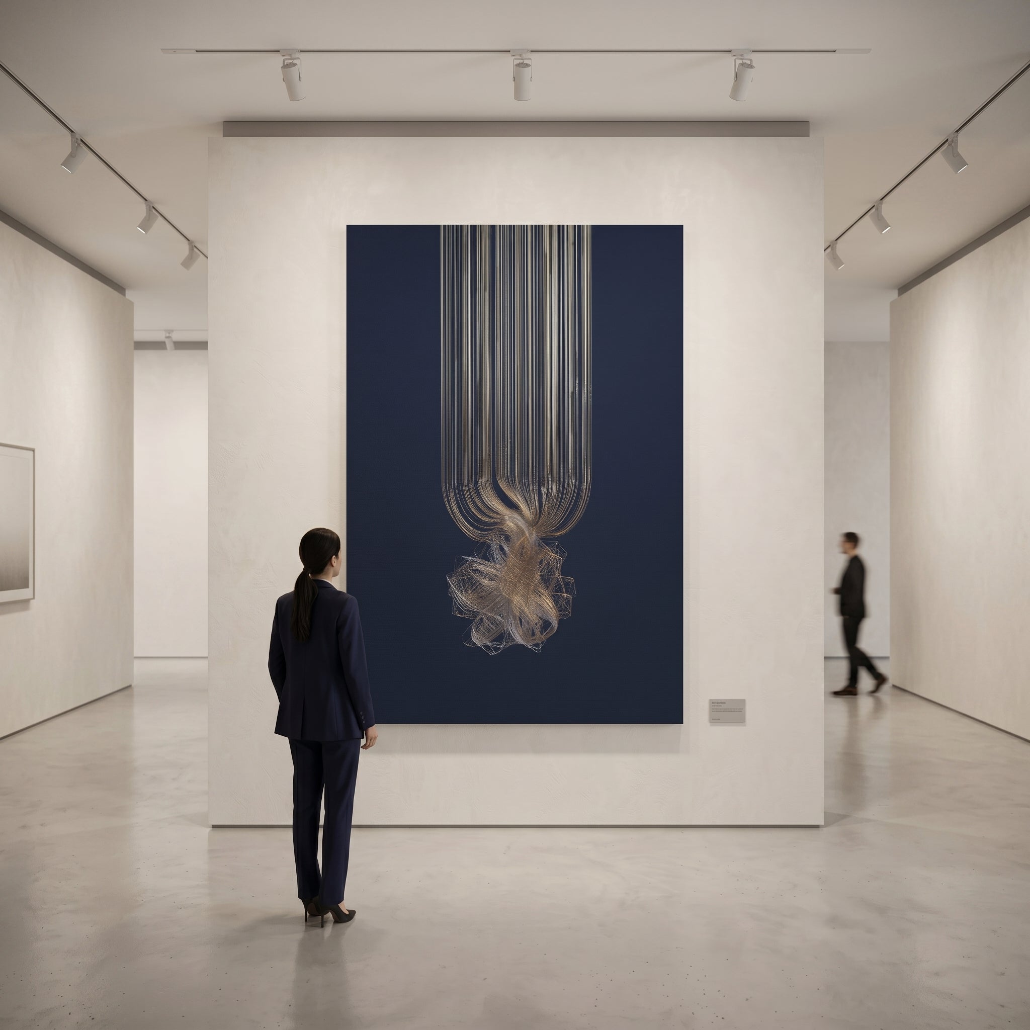
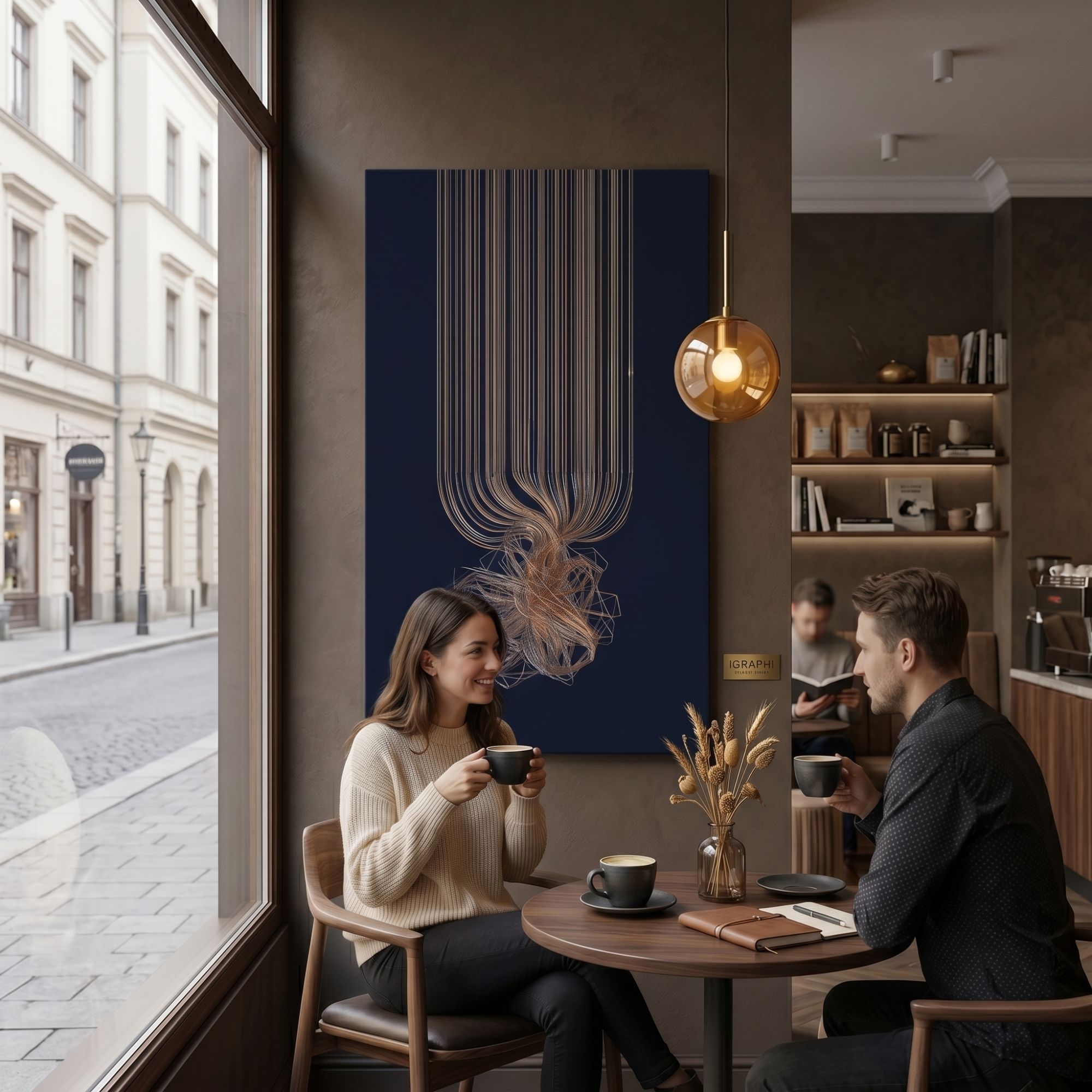
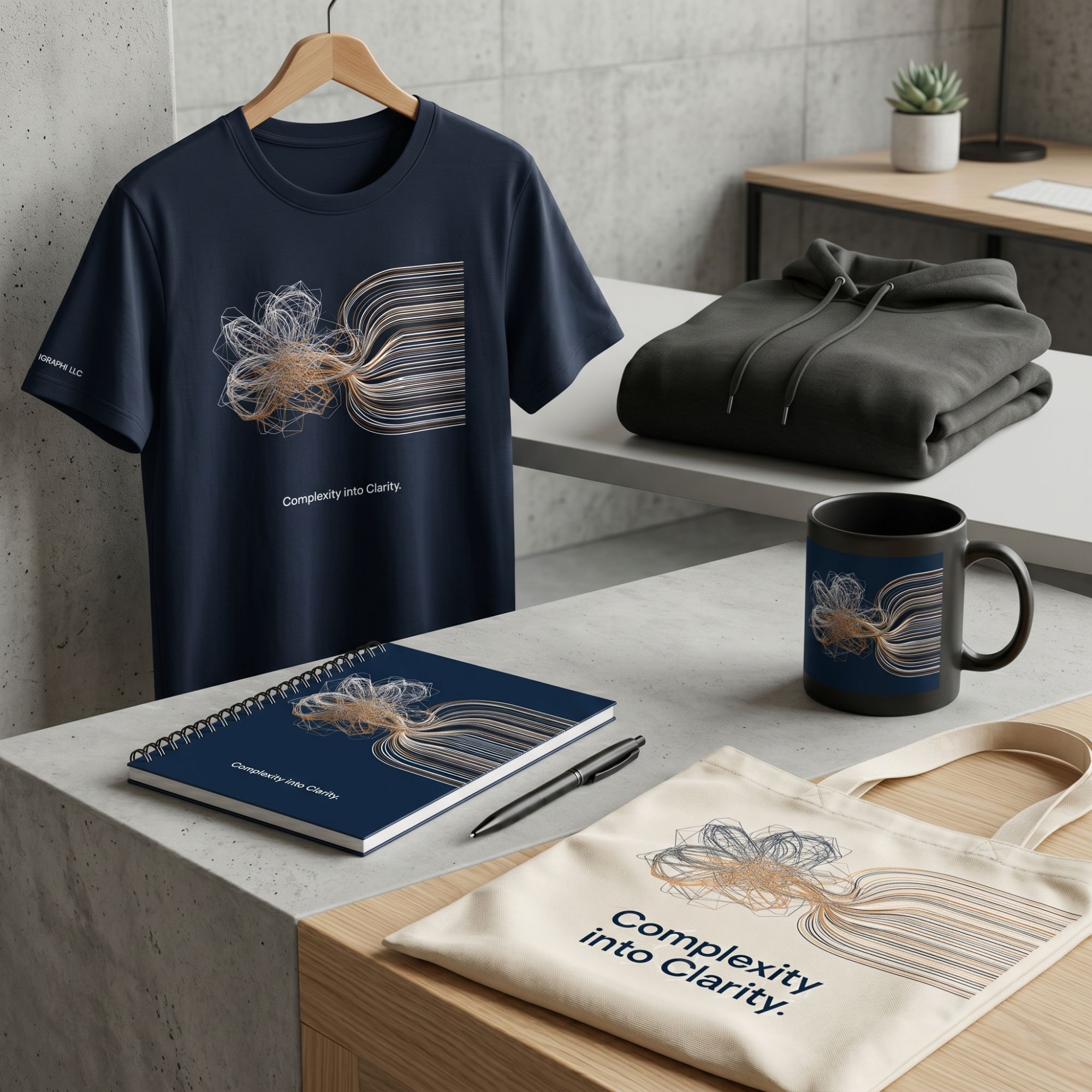
"Complexity into clarity."
Brand Tone
Vibrant, energetic, creative, and playful. iGraphi communicates imaginative design solutions with approachability while retaining high-end visual execution.
The Rabbit Motif
The rabbit represents agility, intelligence, and boundless energy. For iGraphi, it is a smart, playful design mark — fast, memorable, and full of character. It avoids feeling overly corporate, standing instead as a striking hallmark of creative energy and precision.
Logo System
Primary marks, lockups, and clear space rules.
IGRAPHI
Complexity into clarity.
IGRAPHI
Complexity into clarity.
Color Palette
A vibrant palette built around the primary red, balanced by energetic accents.
iGraphi Red
Cobalt Blue
Sunny Yellow
Mint Green
Deep Midnight
Typography
Expressive, elegant, and highly readable type pairing.
Used exclusively for large headlines, presentation titles, and report covers. Provides editorial elegance that contrasts beautifully with the vibrant palette.
abcdefghijklmnopqrstuvwxyz
0123456789 & @ # % * ! ?
Highly legible neutral sans-serif for body copy, data visualization, navigation, and sub-branding. Ensures clarity amidst the vibrant palette.
abcdefghijklmnopqrstuvwxyz
0123456789 & @ # % * ! ?
Graphic Language
Playful shapes and patterns derived from the logo's geometry.
The Ear Curve
Derived from the smooth inner curve of the rabbit's ear. Used for soft image masks, stickers, and content callout boxes.
Playful Data
Pill-shaped geometric bars reflecting vibrant styling — ideal for infographics, data callouts, and publication layouts.
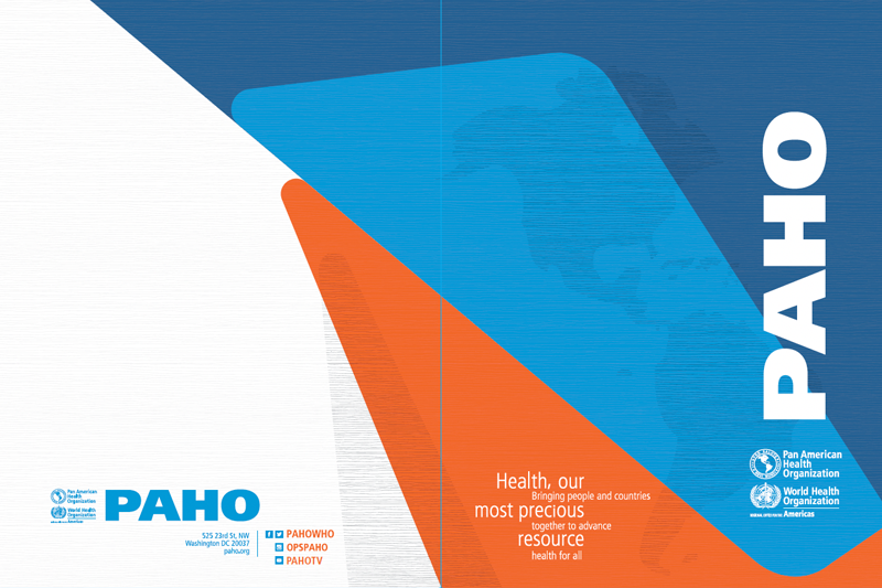
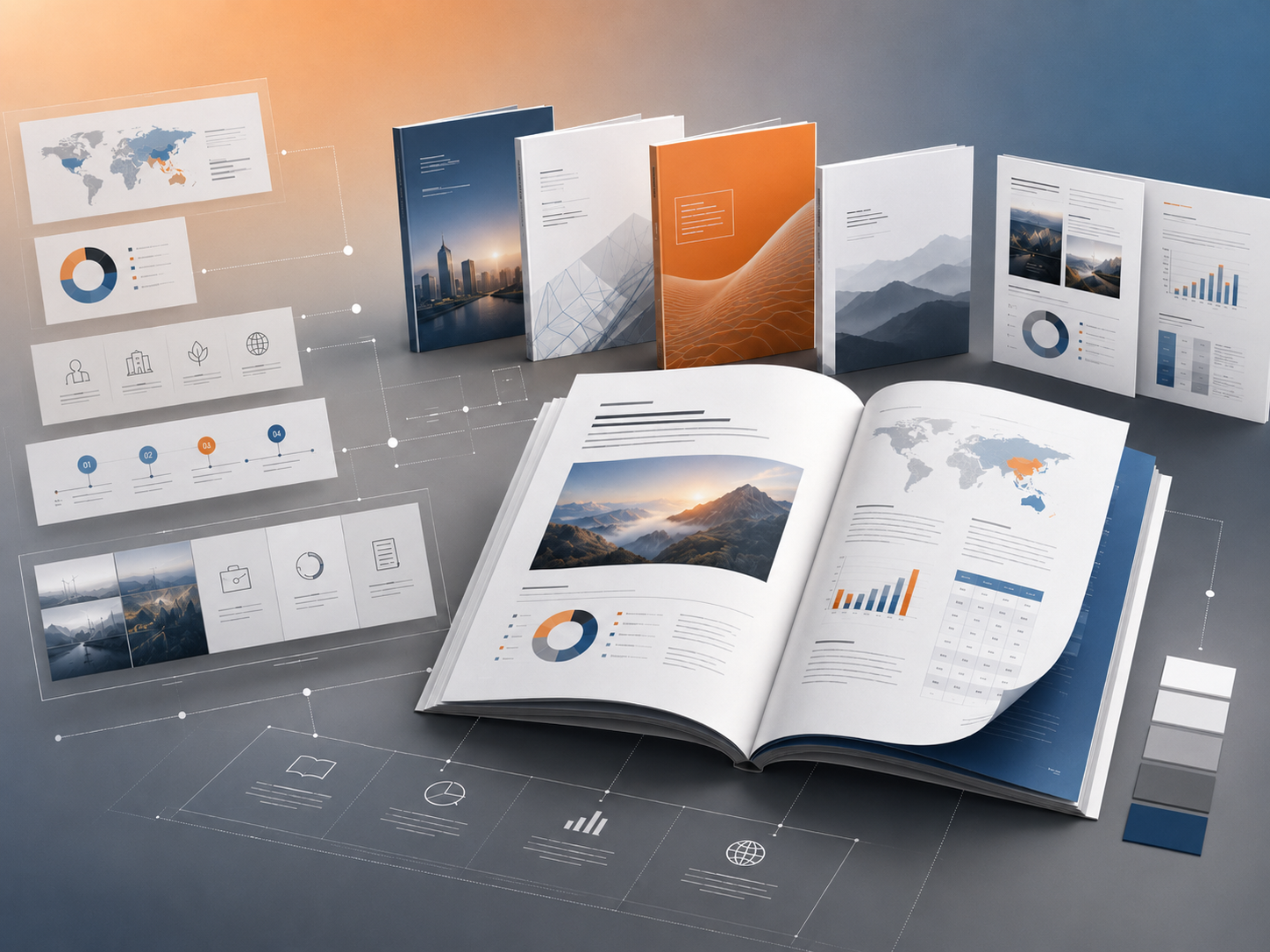
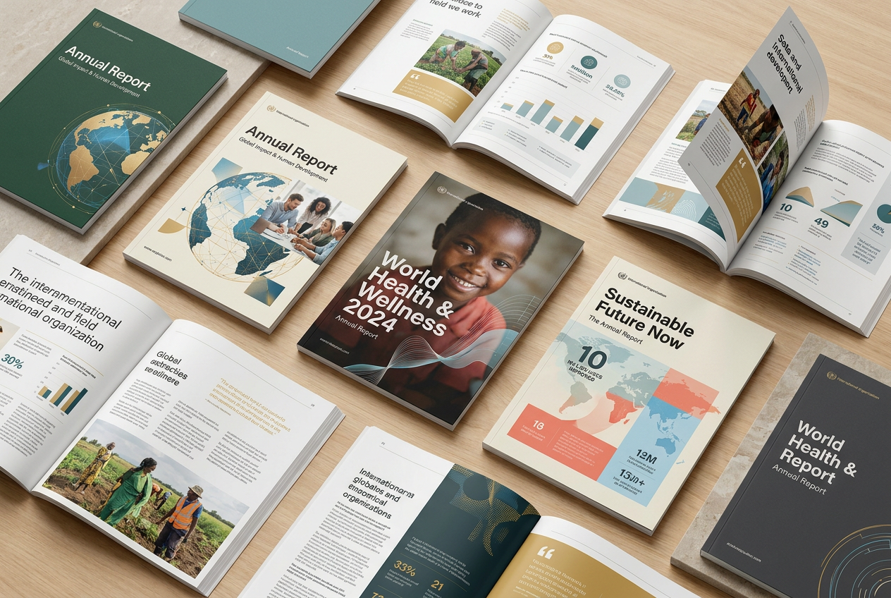
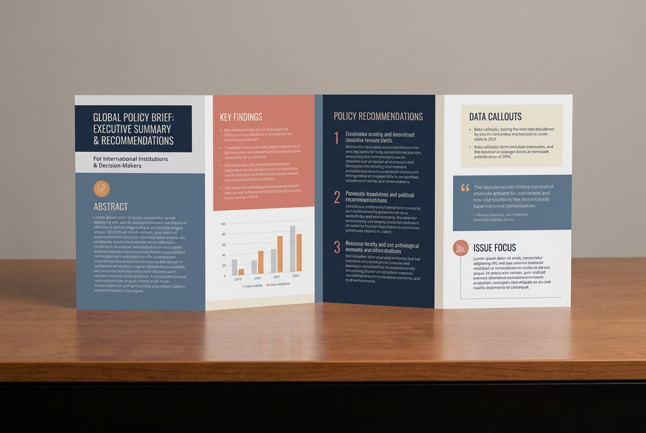
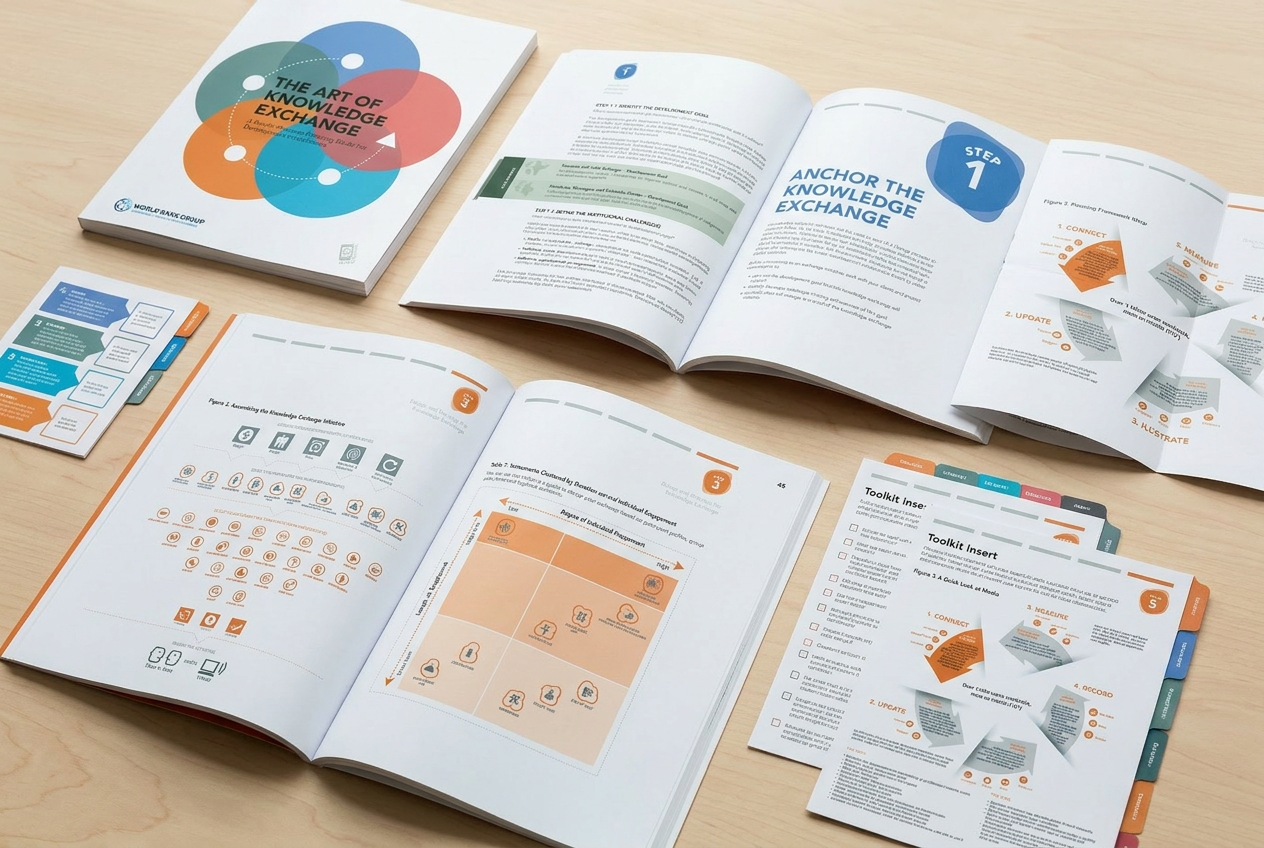
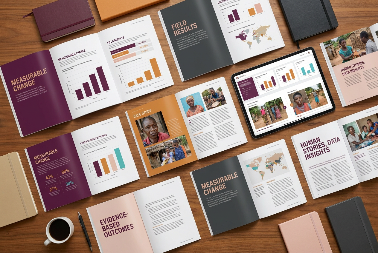
Collateral & Print
Business cards, letterheads, and report covers.
igraphi.com
Washington, DC
Creative Visual
Communication
Complexity into clarity.
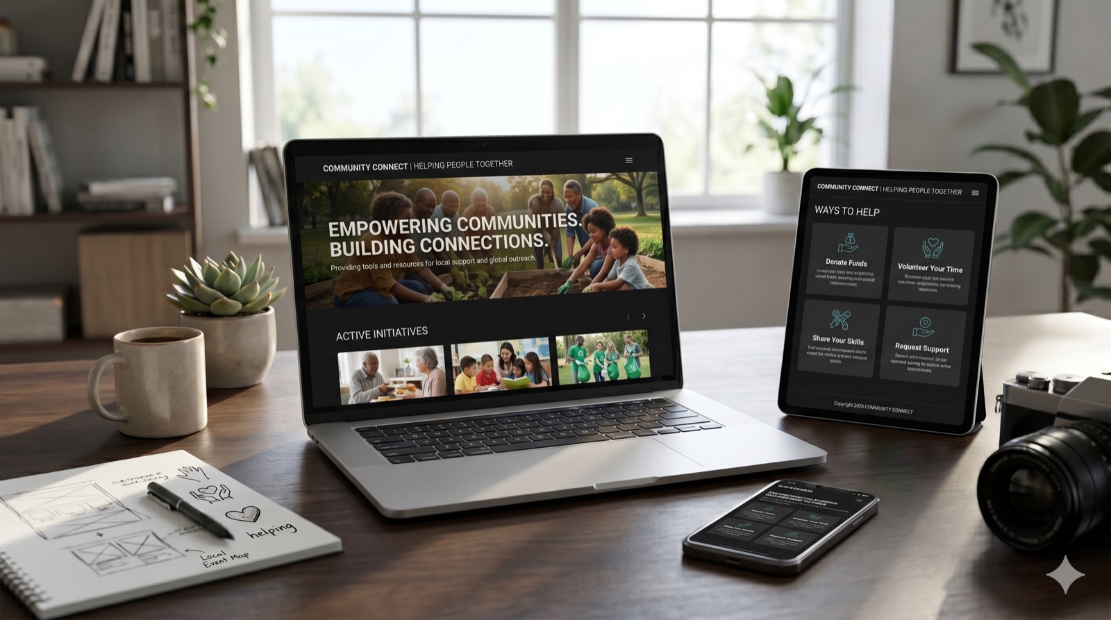
Digital & Web
Website hero concept and social media templates.
Design with
impact.
Complexity into clarity. Presentation systems, reports, and vibrant brand identities for teams doing serious work.