Whilst the term “flat design” might not be a phrase you’re yet familiar with, you will definitely have noticed the concept and the design features whilst browsing the internet.
For those of you that have noticed an increase in the “drop shadow” trend in web design, the easiest way to describe flat design is to say it’s the opposite of that. Flat design is designing a website that has left behind the drop shadow and the 3D effects, and that is by all intents and purposes flat.
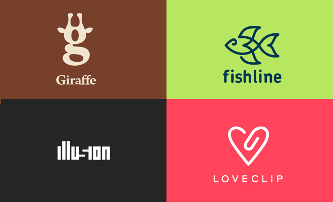
Flat design looks modern, fun, fresh and refreshingly simple compared to it’s 3D counterpart. Flat design is embracing the use of solid colors, sharp, well-defined typography and bold shapes. It takes away any faff and fussiness from the design making it so much easier to digest and to navigate. It’s modern and is without a doubt going to be a huge design trend this coming year.
How can you use flat design?
For me, the top selling point of flat design is the simplicity and minimalism of it. That’s not to say you need to have a simple product or minimalist brand to use this trend to your advantage. I actually like the way this trend could modernize a relatively complex or old-fashioned niche, making the information on your site easier for readers to take in and understand.
Of course, the simplicity of flat design makes it so much easier to optimize for different devices too which is another point in its favor.
We all know that mobile browsing is on the rise, and responsive design has already addressed this rise. Flat design makes web design more scalable in a similar way, because when you design with solid colors, rather than a more image based approach, you’re using less detail and so the information based footprint of your website becomes much smaller. This means it’s quicker to load and communicates faster with whatever platform your reader is using to view it on.
Where have you seen it before?
Flat design isn’t exactly new. You’ll actually notice that brands such as Microsoft had already embraced the trend a few years back, while other big brands such as Apple were too busy perfecting other techniques.
Looking back to 2007, a quick glance at the Microsoft Zune – and you can already see that clean, typography based interface taking shape. At the time it went relatively unnoticed, being overshadowed by bigger industry developments, but in 2013 it is definitely at the forefront of design trends.


